Geometry is not only associated with mathematics, art and nature. One application that I have wanted to explore in depth since choosing my keyword is geometry as it occurs in spiritual art and design, a concept I encountered first hand while travelling in Southern India in the year 2000.
I was lucky enough to arrive in India at the start of the Pongal Festival, a Tamil harvest festival in which people celebrate the sun and appreciate the gods and goddesses for a successful harvest. This festival takes place every year in January. Generally the women in a household rise each morning and draw intricate geometric patterns on the ground outside their houses or on the floors within the houses. These patterns are created from various materials: rice flour, chalk powder, rock powder or synthetically coloured powders.
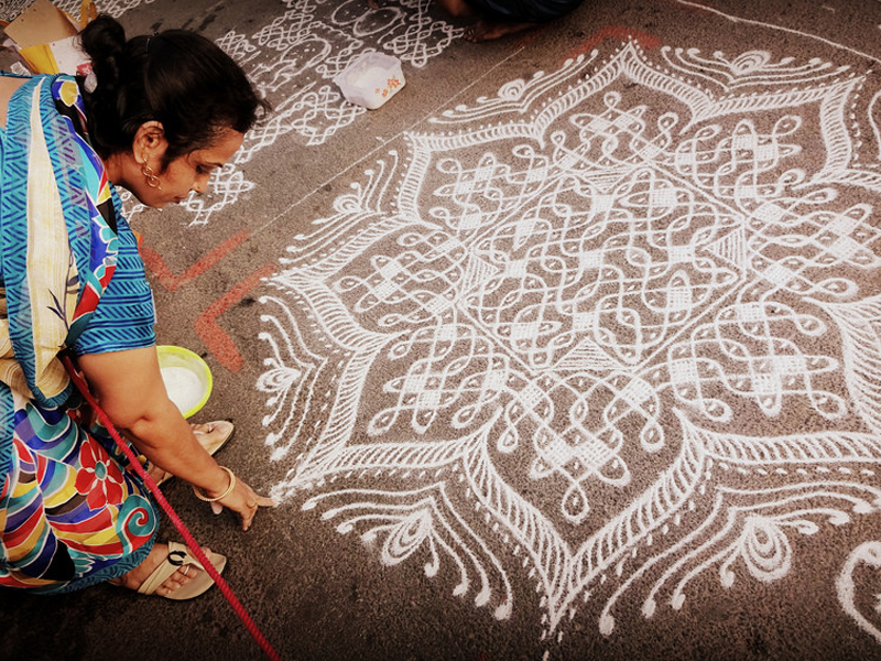
The Tamil people of Southern India believe that by drawing the kolams and paying homage to the harvest, the goddess Mariyamman will grant them blessings and increase the prosperity of their home and family (Laine, 2009). At the time of seeing these patterns—of walking among and across them with my bare feet—I had no idea that they would leave a lasting impact on my creativity in years to come. As a young woman, I was not so keenly aware that this practice is only carried out by women and that it is a way for them to invite well-being, express their spirituality, but also measure their creativity and dexterity (Ascher, 2002). The tradition of kolam creates a space for Indian women to experiment art and also science. It is the meld of religion, spirituality, creativity, mental discipline and mathematics. Kolam drawing connects women with the wider community (the harvest) and with the family (the blessing), but it is also a personal and internal exercise.
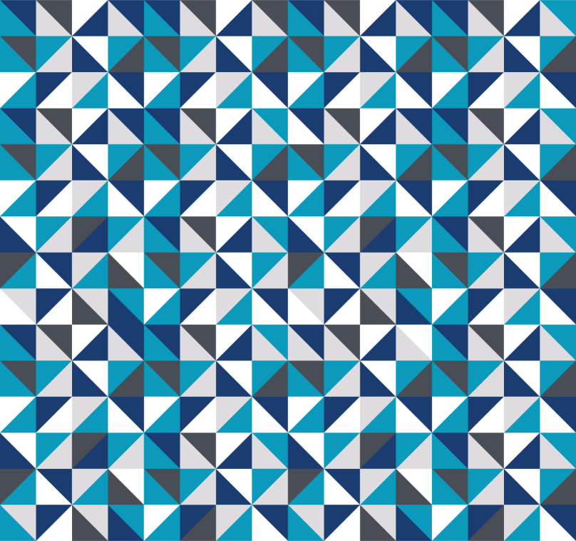
This is an interesting practice that relates to my work on the MA because most of the kolams are represented using geometric shapes and formations. The repeating, symmetrical patterns range from basic white kolams to elaborate, kaleidoscopic designs.
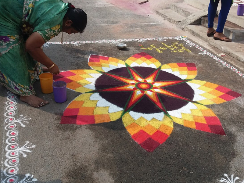
Kolam is a form of visual language, and interestingly computer scientists have become interested in the algorithmic nature of some of the designs as a way of creating picture languages (Ascher, 2002). This only reinforces the idea that many of the patterns, passed down from mother to daughter and spanning countless generations, are a highly skilled practice and require a taught technique.
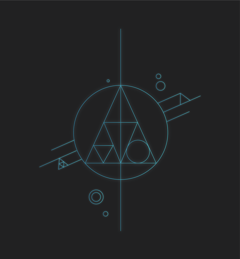
My experience with kolam and later with mandala has led me to create my own concentric geometric designs, paying homage to the things that are important to me. The following design was created in 2017 using mandala as inspiration. This is one of a four-part series work in progress based on the seasons.
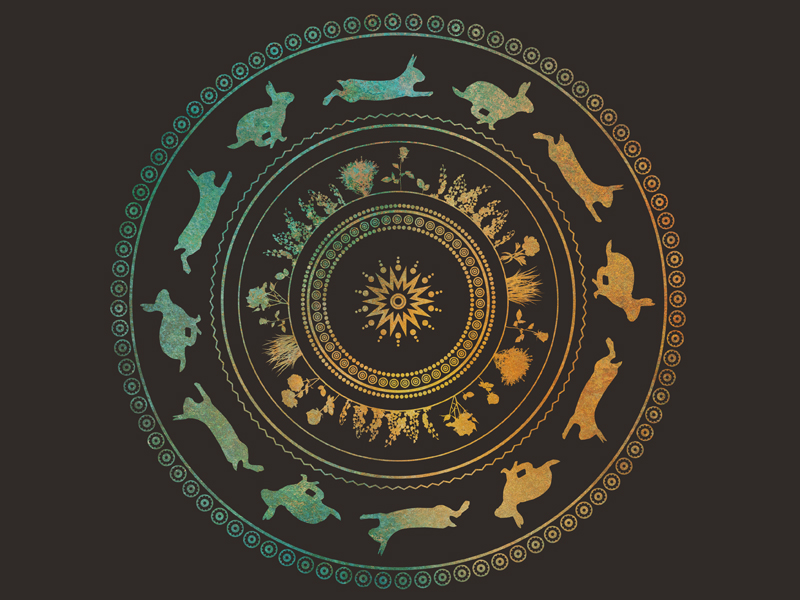
A mandala (Sanskrit for “circle”) is another form of concentric geometric pattern drawing that is conducted across the world in different countries. Specifically healing mandalas are created by cultures including Tibetan Buddhists and Navajo people in North America. In his article Mandala Constructing Peace Through Art, Tom Anderson discusses the drawing and deconstruction of mandalas as a way to explore the idea of “reconstructing” —a caring, cooperative and self-reflexive community project (Anderson, 2002). They are intended to protect or repair either people or the environment. Their aim is to restore balance and harmony—a theme that plays a large role in other areas of my research into geometry. These processes also bring a social harmony and reinforce shared beliefs, morals and values (Anderson, 2002). In its own way, it is a form of art therapy and is seen as a positive practice.
This relates to art in general as a form of visual messaging, a shared experience but an experience that is at the same time deeply personal to whoever is viewing the art.
In Sacred Geometry, Deciphering the Code, author Stephen Skinner writes that geometry is the archetypal patterning of many things, perhaps all things (Skinner, 2006), and this notion has become more and more evident to me as I have read, researched and written about geometric shapes in their many forms and applications. Over the months my sense of geometry being universal has grown stronger: it is a form of common language between humans, a way of reasoning in the sciences, a way of communicating within our belief systems, and a way for us to figure out where we are in relation to the rest of the world.
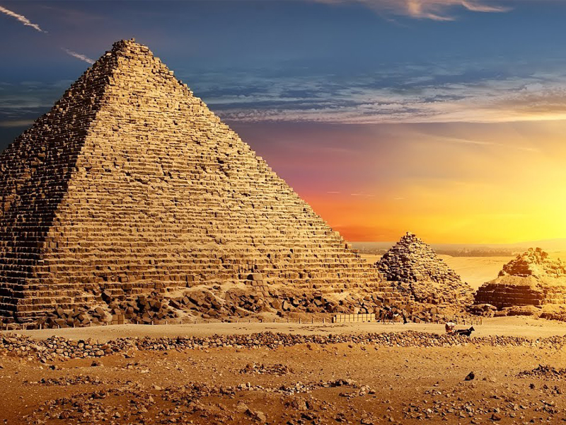
Skinner goes on to discuss geometry dating back to ancient times, most likely beginning in Egypt, with temples and other sacred spaces designed around geometric formations and scientists using geometry to map the movement of the heavenly bodies and the seasons (Skinner, 2006). These geometric buildings were intended for people to use to communicate more directly with their deities. The harmony and precision of the structures made them sacred. I believe this ties in with a common thread I have encountered throughout my research, which is that people take comfort and solace in the structured, organised, harmonious nature of geometric shapes.
With this knowledge and my own personal interest in pattern-making and mandala / kolam design, I am eager to explore geometric design more in my work. It is a strong language and an effective way of communicating ideas and messages across the world, something that language cannot alone achieve. In this regard, art transcends other forms of communication and touches people from all countries and all walks of life.
References
Anderson, Tom (2002): Mandala Constructing Peace Through Art. Art Education Journal, 55:3, 33-39.
Ascher, Marcia (2002): The Kolam Tradition. Sigma Xi, vol. 90, No. 1. The Scientific Research Honor Society. North Carolina, USA.
Laine, Anna (2009): In Conversation with the Kolam Practice: Auspiciousness and Artistic Experiences Among Women in Tamil Nadu, South India. University of Gothenburg, School of Global Studies. Sweden.
Skinner, S (2006): Sacred Geometry, Deciphering the Code. Sterling Publishing, New York, London.